This One Thing Makes a Small Business Have a Better Growth Trajectory
- DaMarcus Nelson

- Dec 30, 2025
- 5 min read
Back in college around 2017, our curriculum was deep in the world of corporate identity design. We were studying the giants like Coca-Cola, Apple, IBM. These systems were built for massive organizations with global scale, dozens of departments, and thousands of touchpoints.


At the same time, my friends back home were building rough-and-ready small businesses like mobile iPhone repair, a garage screen-printing setup held together by optimism and YouTube tutorials, and an urban farm. Nothing “corporate” about any of it.


I would go to class for the day, then come back home to talk business with the guys and couldn't help but to notice a huge gap in how they were thinking through their brand. They were surely focused on the operational side of things which was great, but I saw that they needed a true visual identity and better marketing materials.
Their small businesses didn’t need a 120-page brand standards manual, however they needed just enough structure to look credible, consistent, and trustworthy.
So I took what I was learning in school and translated it into something that fit their world.
The question that I was asking myself was, "How could I help a small business have a better growth trajectory?"
Most small businesses aren’t lacking creativity, they're lacking structure
Before I stepped in to helping my friends with their marketing materials, their visuals looked like most mom-and-pop shops before the corporate design era:
No real logo system
No color standards
Typography changing every day
Whatever Word templates they could find (this was before Canva became popular)
Nothing repeatable
It wasn’t a lack of talent or vision. They simply didn’t have a framework.
The corporate world calls their systemized approach “brand identity,” while small-businesses and mom-and-pop shops approached identity as, “I just need something that works.”
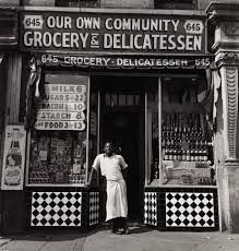

A Short History of Small-Business Design Before Corporate Identity
Before corporate identity emerged in the 1950s and 60s, small-business design looked completely different. It wasn’t strategic, polished, or intentional. It was local, instinctive, and focused on survival, not branding.
Here’s the quick snapshot.
Design Was Functional, Not Strategic
From the early 1900s through the 1940s, mom-and-pop shops needed basics:
a readable sign
a menu or price sheet
packaging that worked
a storefront that looked respectable
No brand story. No guidelines. Just “does this help customers understand us?”
Craftspeople, Not Designers, Did the Work
Visuals came from:
sign painters
print shops
hand-lettering artists
catalog templates
newspaper ad reps
They weren’t building identities, they were producing whatever the business needed in the moment. Every town had its own handmade look.
Tools Shaped the Aesthetic
Design choices were limited by:
available fonts at the print shop
the cheapest paints or inks
sign painters’ personal lettering styles
stock borders and ornaments
Availability, not branding, dictated style.
Consistency Didn’t Exist
A shop might look different on:
its sign
its bags
its ads
its delivery vehicles
People recognized the store itself, not a unified identity.
Colors and Type Were Physical Constraints
Paint colors, ink sets, neon gases, and metal type determined how things looked. Owners chose typography based on taste or whatever the printer showed them. The results were personal, often imperfect, but authentic.
Community Culture Influenced Everything
Before national chains, visuals naturally reflected:
local materials
regional traditions
immigrant culture
neighborhood competition
Identity wasn’t designed, it was lived.
Advertising Was Simple and Direct
Messages were straight to the point:
“Fresh Meat”
“Cold Drinks”
“Shoe Repair”
No taglines, no strategy. Just clarity.

Logos Were Rare
Most shops used wordmarks, lettering, or mascots pulled from clip-art books. A true logo mark was considered premium work.
Corporate Identity Changes the Game (1950s–1970s)
When large companies needed consistency across multiple locations, design became standardized and intentional. This era introduced:
grids
guidelines
rational systems
psychology-driven design
Modern branding was born.

Small-business design used to be reactive and tool-driven.
Corporate identity made design intentional.
Introducing identity principles changed everything.
Visual identities can help a small business have a better trajectory for growth.
Going back to the story of my friends, I gave them simple, digestible identity systems; not the corporate kind, but accessible ones. It clicked for them.
I showed them why:
consistency matters
clarity builds trust
a logo is a tool, not decoration
color and type create recognizable memory
design influences buying decisions even when people don’t notice it
We might not have had all of the vocabulary at the time, but the difference was felt.
Design stopped being “a cool graphic” and started becoming an asset.
Looking back, I realize I was democratizing corporate identity
I didn’t have that language at 19 or 20. All I knew was that my friends deserved the same level of thought that large companies who paid tens of thousands for—just scaled down to where they were.
I wasn’t trying to build perfect design systems, heck, I was still learning about applying design for myself. Nevertheless, I was trying to give my community a fighting chance in a world where presentation matters.
Years later, they’ve come back and asked me to help them fully development their brand and visual identity.
There was a seed planted that through reinforced education and real-world results, began to grow and take shape. That’s the power of identity design when it’s applied at the right level.


This era shaped the designer I became
Working with small suburban businesses did more for my creative maturity than any corporate case study. It taught me:
how to simplify
how to design for clarity
how to adapt strategy for real life
how to educate clients without overwhelming them
how to design for where someone is going, not just where they are
It showed me that identity design isn’t reserved for corporations. It’s a tool that belongs to anyone building something with intention.


Why I’m Sharing This Now
Today, brand identity has become mainstream. Side hustles, solo entrepreneurs, nonprofits, churches and everyone wants a system that makes their work feel intentional and credible.
But back then? Most people in my spaces didn’t even know what “identity design” meant.
So as I look through old photos of those early projects signs, logos, flyers, screens, mockups... I see the seeds of everything I do now.
It wasn’t perfect. It wasn’t polished. But it was foundational.
And it proved something I still believe:
Good identity design doesn’t make a business corporate, it makes it clear.
See more of my work and dive deeper into my process at damarcusnelson.com.


Comments